Here’s a few interesting bits of vexillology and imperialist sentiment that I came across when researching the previous two posts.
The detailed mix of the issues of flag similarity and representations of relationships to imperialism and colonialism just gets more and more complicated.
I thought you might be interested …
The ‘Stars and Stripes’ and other revolutionary flags
The ‘star-spangled banner’ has to be one of the most recognised and recognisable flags in the world.
Here’s a country that famously fought a revolution to gain independence from the British Empire. A proud and brave people, energised by ‘Enlightenment’ values. A shining ‘beacon on a hill’ spreading principles of democracy, human equality before the law and the antithesis of all things imperial and colonial … with, oddly, a bit of slavery and Civil War thrown in.
Or so the story goes.
If any flag does, America’s flag must surely embody, symbolically, a rejection of its colonial and imperial origins?
Here it is then, the official flag of the Unites States of America, the ‘Stars and Stripes’:
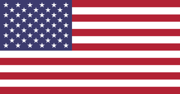
There are thirteen stripes (alternately red and white – though in some versions, interestingly, they were red, white and blue). We are told that they represent the original thirteen colonies that declared independence. There are, now, fifty stars each representing a state.
The number of stars began at 13 and changed, progressively, to accommodate the additional states. The fifty star flag was established by President Eisenhower in 1959 and has been the same since.
So good so far.
Importantly, there could be few other countries that so resoundingly declared their independence from a colonial power. Because of the globally mythological importance of the ‘American Revolution’, few people today would equate the ‘stars and stripes’ with colonialism – unless that was the colonialism of the United States itself; but that’s another story.
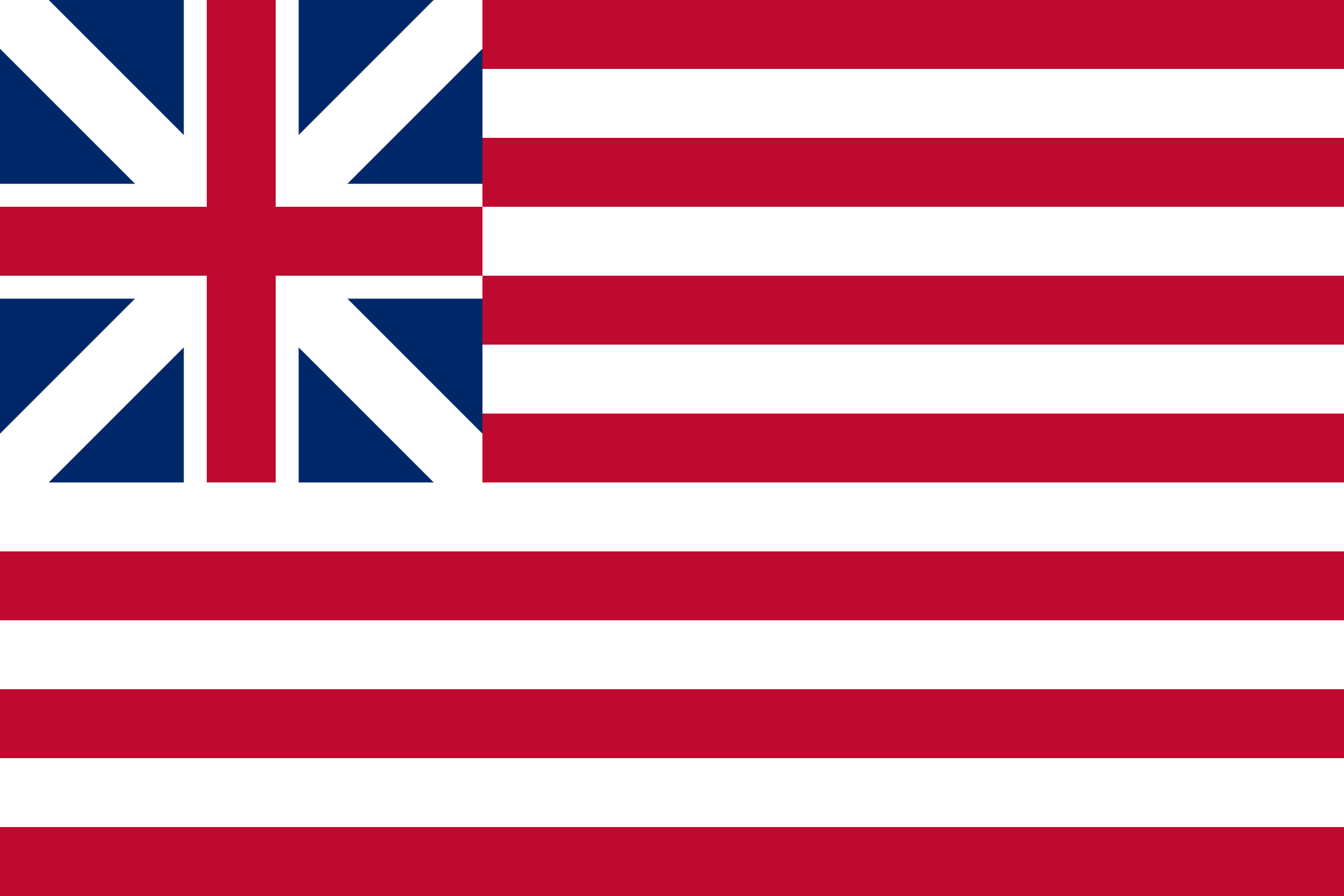
By Hoshie, Yaddah. – Made by Hoshie, Public Domain, https://commons.wikimedia.org/w/index.php?curid=574763
No, it’s not some transatlantic wag doing a bit of photo-shopping.
It’s called the ‘Grand Union Flag’. It is recognised as the first national flag of the United States. Admittedly, it didn’t last long (from 2 January 1776 till 1777) and the revised flag that replaced it had a ‘new constellation’ of stars in the canton where the Union Jack previously sat.
But here’s something else; one version of the flag of the British East India Company:
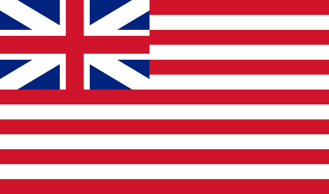
British East India Company Flag 1707-1801
Not identical, but certainly very similar to the ‘Grand Union Flag’. And, under one theory at least, some of the Founding Fathers are thought to have been aware of the flags of the British East India Company.
Surprisingly, then, it turns out that the Union Jack is not the only element of the Grand Union Flag that may be derivative of the (former) colonising power.
Irrespective, the stripes in the ‘stars and stripes’ did not appear to be a problem for the ‘Founding Fathers’ of the US despite fighting for independence from the very same power that brought red and white stripes to flag design as part of its first – and perhaps most infamous – tentative steps into global imperialism.
Of course, given that the British (formerly the ‘English’) East India Company was the private enterprise originator of the British Empire (the British military were used as a ‘back up’ for private interests around the globe) perhaps the early leaders of the land of the free (and of private property rights) quite liked the connotations implicit in the British East India Company flag and so were happy adopters of its design.
Who knows?
Then there’s the quite different case of another revolutionary flag, the Haitian flag:
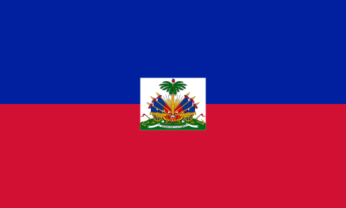
Flag of Haiti
It is no coincidence that the colours red and blue are there – Haiti threw out its French colonial masters in a revolution in the early 19th century. Quite an achievement.
What happened next?
Haitian lore holds that the newly appointed revolutionary leader Jean-Jacques Dessalines created the flag by taking a French tricolor and ripping out the white center, which he discarded. He then asked Catherine Flon, his god-daughter, to sew the remaining bands together.
The vertical red and blue stripes (lacking the middle white stripe) were deliberately taken from the French flag just in order to represent independence in the original version of the flag:

Flag of Haiti 1803
Subsequently, there was a bit of to-ing and fro-ing with the blue being changed to black and then back again. The blue was often reinserted by Republicans while the black was associated more with the early so-called Haitian Empire and Kingdom.
The ‘white’ in the French flag has been said to have a number of meanings. One of them relates to the French aristocracy, l’Ancien Regime (Ancient Regime). Lafayette called it the “ancient French colour” (i.e., a ‘national’ colour) but a pure white flag was used by the Kingdom of France during the Bourbon Restoration (1814-1850).
If that’s the case then, in effect, Jean-Jacques Dessalines basically ripped out either the ‘national colour of France’ or symbolism of the French monarchy. But the bulk of the flag of the colonial power was retained – the blue and red colours of Paris that were adopted by the original French revolutionaries.
There’s also a twist to the interesting pedigree of the Haitian flag that goes back to the question of the similarity of flags. It’s the strange case of the flag of Lichtenstein (which borders Switzerland and Austria):
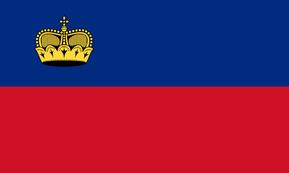
Flag of Lichtenstein (Public Domain, https://commons.wikimedia.org/w/index.php?curid=433227)
Apparently:
Adopted in 1921 after being officially enshrined into the nation’s constitution, it has been the flag of the Principality of Liechtenstein since that year. The crown was added to the flag in 1937 after the country found out at the Summer Olympics held the previous year that their flag was identical to the flag of Haiti
A variant of the Haitian flag does not (or did not) have anything other than the red and blue horizontal stripes, hence the identical nature of the flags at the 1936 Olympics.
Forget mistaking the New Zealand flag for the Australian flag on the Olympic podium. That’s nothing. Here there was no room to make a ‘mistake’ – both flags were the same.
Yet all that was done by way of remedy was the placement of a crown on the flag. Why didn’t Lichtenstein dispense with the red and blue stripes altogether given this embarrassing identity?
I can’t speak for Lichtensteinians, least of all presumably long dead ones, but, at a guess, I suspect that (a) they were attached to their then current flag and (b) part of that attachment was that it symbolised their historical royal colours connecting back to the Holy Roman Empire (though a yellow-over-red variant was also used in the 19th century). Lichtenstein was clearly not interested in abandoning part of its long heritage merely because someone else’s flag was similar (identical).
So here are two flags (Haiti and Lichtenstein) that were not just similar but identical and yet the origin of the design and its meaning was entirely different. They remain similar and presumably it would be possible to continue to confuse them to this day.
Long live the Empire?
There’s an intriguing – even worrying – bit of information about the resilience of imperial sentiment in the United Kingdom itself.
There was an interesting article on The Guardian website recently that was titled “Is a Queen Victoria statue offensive? It’s about time we debated our colonial past“.
It seems some Oxford students have objected to the presence of various statues in honour of colonialists such as Cecil Rhodes, slavers, “white supremacist” South African Prime Minister Jan Smuts and “even Queen Victoria“. But the students, apparently, are in a minority:
A poll in January found that 43% of Britons think the British empire was a good thing – only 19% dissented, while 25% opted for neither – while 44% believed we should be proud of colonialism, with just 21% arguing we should regret it. Hardly surprising, though, given the airbrushing that has taken place. How many people know about, say, the millions of Indians killed by famines that have rightly been described as “engineered” by the British empire?
I’ve left the two links in the quotation ‘live’ – the second is the same extraordinarily sad and angering article about the Bengal famine that I’ve already linked to in the previous post; but the first (about the poll) is telling. The poll was carried out over 17-18 January 2016 with a sample of 1733 “GB Adults” (full poll results here).
Here’s the graphic from that last link:
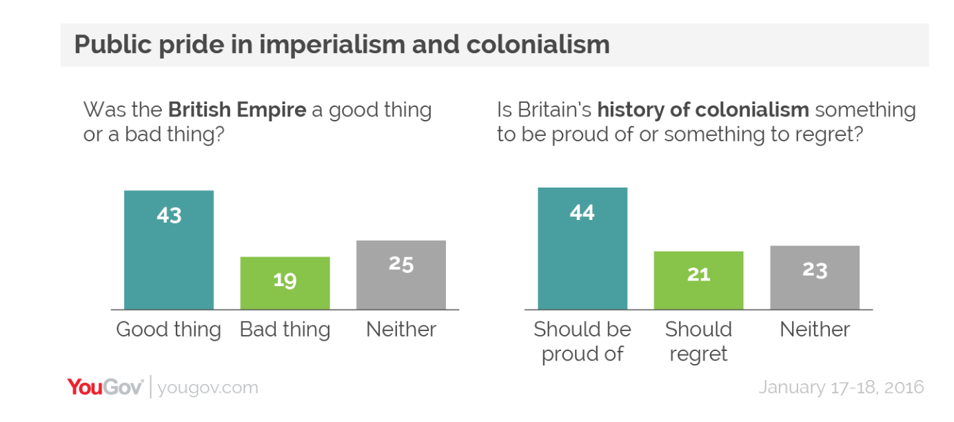
YouGov poll of Britons’ attitudes to Empire and Colonialism in January 2016
In an earlier YouGov poll in July 2014 it was found that:
British people tend to say the countries that were colonised by Britain are now better off for it (49%) rather than worse off for it (15%). And 34% even said they would still like Britain to have an Empire, while 45% said they would not.
In that same poll there was also this interesting finding:
The Commonwealth Games in Glasgow this year are the latest reminder of the British Empire, and of a determination to present its legacy as constructive. YouGov also asked which countries British people would especially like to do well at the events, with Australia, New Zealand and Canada being most favoured.
The imperial ‘ties that bind’, it seems, are still strong – and I imagine not only on the British side.
I wonder what most New Zealanders, if asked, would say, on balance, was the overall impact of the British Empire on the world?
Now that would be interesting.
Another ‘alternative flag’
Another flag design has recently been doing the rounds of Facebook (it may have done the rounds earlier but it’s only just come to my attention).
It’s quite an interesting one – at least for me – because, unlike the alternative flag in the referendum, it does seem to address in its design those cultural-political realities that define modern nations (and their flags) as I argued in the previous post.
Here it is:
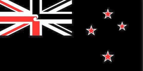
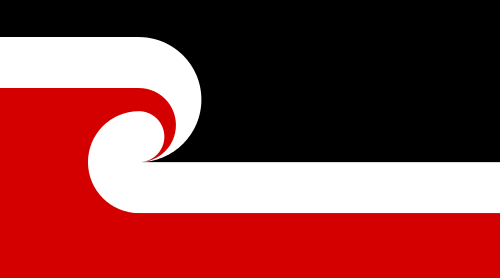
Another NZ Flag Design
Whether or not you like the design I think you have to agree that it’s very clever. It retains the basic design of the current flag – which shows continuity with the past.
It nevertheless alters the symbolism of the basic components of the current flag.
Most obviously, the ‘Union Jack’ is no longer the Union Jack but a design that incorporates references to the tino rangatiratanga flag, the flag of the Maori sovereignty movement (both in design elements and colouring):
Tino Rangatiratanga Maori Sovereignty Flag
And, significantly, that motif is at the very centre of the much modified ‘Union Jack’. The ‘Jack’ itself is dual coloured (red and white in the lower diagonal and black and white in the upper diagonal).
Symbolically, it easily can be seen as representative both of New Zealand’s colonial origins and of a major transformation of that imperial and colonial symbolism through interaction (or partnership) with Maori.
Anyone not from New Zealand but who was familiar with flags would immediately recognise the modified ‘Union Jack’ and the obvious question would be ‘And why has it been changed?’ – and that question would then invite the narrative of New Zealand’s political and cultural realities.
Or, at least, it would if those design elements had emerged from a national discussion focused on the kinds of questions I raised in the previous ‘flag’ posts.
If such discussions had led to changed – or explicitly acknowledged – political arrangements that gave – or acknowledged – formal status to Maori sovereignty then it’s possible to imagine a ‘design brief’ emerging that would result in such a flag design being representative of what would then be the new political realities.
But, hopefully, you get the idea of what I think would amount to a design that spoke to the kinds of issues that flags can be very good at representing – not ‘identity’ but political-cultural realities of the nation state.
The only thing about this particular design that I find a bit off-putting is its overwhelming ‘blackness’.
Certainly it makes sense in terms of the night sky (which is where we usually see stars) and, intentionally or not, I guess it also resonates with the omnipresent black in the uniforms of New Zealand sports teams – but it’s an incredibly strong (lack of) colour to have dominating a flag.
Black is also not universally seen quite as fondly as it seems to be here in New Zealand.
Nevertheless, the design at least speaks to political-cultural realities and arrangements: colonial origins and therefore some commonality with other countries that were part of the British Empire; bicultural founding and continuing ‘relationship’; the southern hemisphere locality.
Speaking of black …
As I noted in passing at the start of these posts on the flag referendum, it may well be that the final nail in the coffin of the Kyle Lockwood designed alternative flag is that a lot of people simply don’t like the look of it – even many who might otherwise have voted for a flag change.
Well, if we’re sympathetic to one traditional way of assessing such things (that is associated with the very multiculturalism that Lockwood believes his fern design honours), then we may have found the cause of that aesthetic recoil.
Apparently, the Lockwood blue and black fern design is ‘bad Feng Shui‘ – so bad that it “could bring bad luck, instability and even a stock market crash“.
The feng shui consultant certainly piled it on:
- the new flag had a “yin” design, which wasn’t good, and black on top was a bad omen.
- “In feng shui, black also represents water and water makes stock markets go down”
- “our silver fern cutting across the new design is indecisive”
- “Even the blue is a lighter blue to the current flag, a mark that the country could get weaker.”
- “Flags need more yang elements, like having more red and more solid emblems, that would energise and bring strong growth to a country,”
- “What we have here is a yin flag with a fluttering silver fern that marks instability and no growth.”
After all of that, I’m not even sure I’d risk wiping my dishes with it.
Do we have a nominee here for the next ‘Flag Consideration Panel’ perhaps?
John Key hedging his bets yesterday. http://www.stuff.co.nz/sport/golf/77826942/new-zealand-call-in-prime-minister-john-key-for-celebrity-challenge-at-nz-open
Fascinating, if only more of this level of discussion had been in the maispnstream. What about the alternative red/black jack with Tino Rangatiratanga motif on its own without the black backed southern cross bit
Hi Puddleglum, how about replacing the union jack in the current flag with the Tino flag?
Personally I’d be quite happy with the Tino flag as our country’s flag, but perhaps having it in the top corner and keeping the southern cross would be an acceptable compromise?
Hi Corokia,
Sorry about the long delay in replying.
I’d personally have no problem with that suggestion. The Tino rangatiratanga flag looks well-designed to me and very explicitly incorporates an undeniable foundational element in the country’s history. But, once again, before any such change to the flag was made I’d want it to reflect a real change in our domestic political arrangements.
For me, the ideal in this regard would be some design that explicitly incorporated both signatories of the Treaty and how their relationship is socio-politically constructed today.
Thanks again for the comment.
Regards,
Puddleglum